摹客
产品
Creating Watch Faces
Android Wear supports custom watch faces with designs that can show contextually relevant information to users. Designing a watch face requires a careful blending of data and visual elements that informs users without requiring close attention. Simple, attractive layouts that can adjust to different screen shapes and sizes, provide options for color and presentation, let users create a deeply personalized experience with the Wear device that fits them best. Watch faces exist as part of the Wear user interface, so it is important to provide interactive and ambient modes, and consider how system user interface elements will interact with your design.
Follow the guidelines in this page to design your custom watch faces.
Creating a watch face for Android Wear is an exercise centered around visualizing time clearly. Android Wear devices provide a unique digital canvas to reimagine the ways in which we tell time. Android Wear also lets you integrate data on watch faces for a higher level of personalization and contextual relevance.
These powerful new tools to create watch faces run the risk of overcomplicating a design. The most successful watch face designs leverage these advanced capabilities while delivering a singular, elegant expression of information.
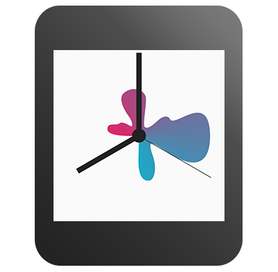
Glanceability is the single most important principle to consider when creating a watch face design. Your watch face designs should deliver a singular expression of time and related data. Experiment with bold, minimal, and expressive design directions that are highly readable at a distance.
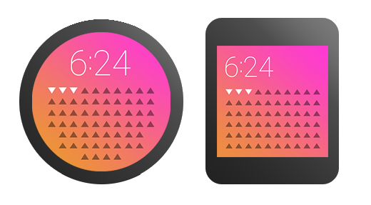
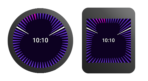
Android Wear devices come in different shapes and sizes. You will need to consider both square and round faces as well as different resolutions. Some concepts work better in a certain format, but a little planning will allow users to enjoy your watch face regardless of screen format.
These guidelines help your concepts align across devices:
Create flexible conceptsIdeally, the visual functionality of the watch face works for both round and square formats. In this example, the visual functionality of the watch face is flexible enough to work well in either format without any adjustment. However, other design concepts require different executions for square and round screens.

Try using a common set of colors, line weights, shading, and other design elements to draw a visual connection between your square and round versions. By using similar color palettes and a few consistent visual elements, the overall appearance of square and round can be appropriately customized while still feeling like part of the same visual system.
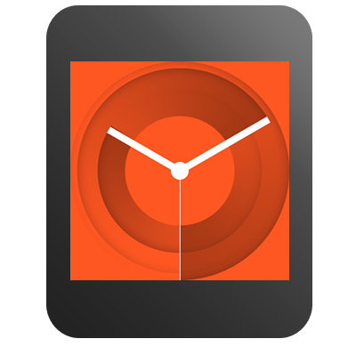
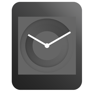
Some of your concepts will naturally take the shape of an analog clock, like a center dial with hour and minute hands. In this case, consider the corner areas that are exposed when translating to a square format. Try extending and exploring this extra space.
Android Wear devices operate in two main modes: ambient and interactive. Your watch face designs should take these modes into account. Generally, if your watch face design looks great in ambient mode, it will look even better in interactive mode. The opposite is not always true.
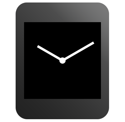
In ambient mode, the screen is only updated once every minute. Only show hours and minutes in ambient mode; do not show seconds in this mode.
When the user moves their wrist to glance at their watch, the screen goes into interactive mode. Your design can use full color with fluid animation in this mode.
Ambient mode helps the device conserve power. In this mode, the screen only displays shades of grey, black, and white. Your watch face is notified when the device switches to ambient mode, and you should thoughtfully design for it.
Android Wear devices feature a variety of screen technologies, each with their own advantages and considerations. One important consideration when designing the ambient mode display for your watch face is how it affects battery life and screen burn-in on some screens.
You can configure your watch face to display different ambient designs depending on the kind of screen available on the device. Consider the best design for your watch faces on all screens.
Pixels on some screens (including OLED and transflective LED) in ambient mode are either "on" or "off", also known as "low-bit". When designing for low-bit ambient mode, use only black and white, avoid grayscale colors, and disable antialiasing in your paint styles. Make sure to test your design on devices with low-bit ambient mode.
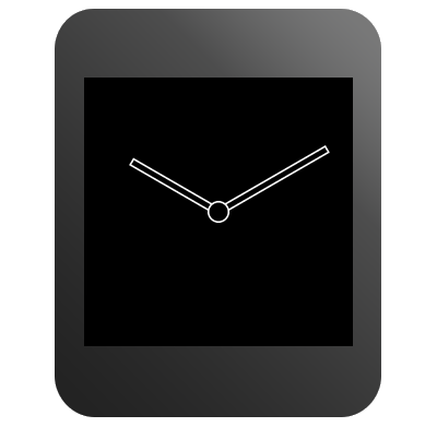
When designing for OLED screens, you should consider power efficiency and the screen burn-in effect. When these screens are in ambient mode, the system shifts the contents of the screen periodically by a few pixels to avoid pixel burn-in. Do not use large blocks of pixels in your ambient mode designs and keep 95% of the pixels black. Replace solid shapes in your regular ambient mode designs with outlined shapes in burn-protected ambient mode. Also replace filled images with pixel patterns. For analog watch face designs, hollow out the center where the hands meet to avoid pixel burn-in in this mode.
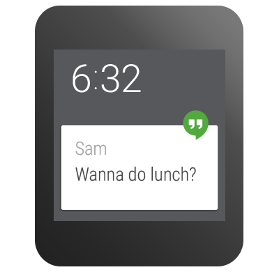
Your watch face designs should accommodate Android Wear UI elements. These elements give the user the status of the wearable and show notifications from services on the user's phone. Try to keep critical elements in your watch face designs from being obscured by the UI elements.
Cards are the notification system that bridges information between the wearable and a mobile device. Cards are also how most applications communicate with users. The user will be notified on the wearable about items such as emails and messages. As a watch face developer, you need to accommodate both large and small cards in your design. Your watch face can specify a preference for the card size, but users may override this setting. Users can also temporarily hide cards by swiping down on them.
The peek card is the top card in the stream that is partially visible at the bottom of the screen. A variable peek card has a height that is determined by the amount of text within a given notification. A small peek card leaves more room for your design. Round faces with analog hands should have a small peek card. If the time signature is clearly visible above the maximum height of the variable peek card, you may choose to include the variable peek card. The benefit of a variable peek card is that it displays more notification information. Faces with information on the bottom half of the face should leverage the small peek card instead.
The system notifies your watch face when the bounds of a peek card change, so you can rearrange the elements in your design if necessary.
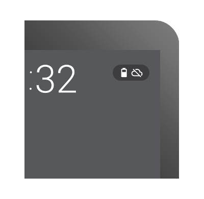
Indicators tell the user the status of the wearable, such as charging and airplane mode. When designing a watch face, consider how the indicator will fall over the watch face.
The indicators can be placed in several fixed locations on the wearable. If you have a large peek card, the indicators should go on the top or on the center of the screen. When you position the status icons or the hotword on the bottom of the screen, the system forces small peek cards. If the edge of the watch face contains strong visual elements, such as ticks or numbers, place the indicators on the center of the screen.
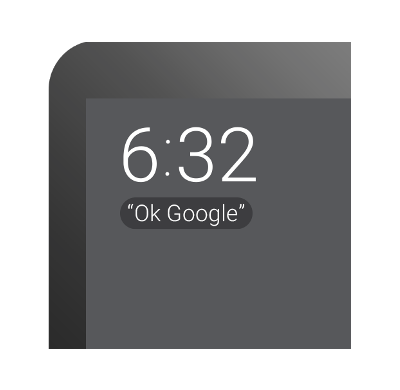
The hotword is the phrase "OK Google", which tells the user that they can interact with the watch using voice commands. When a user turns on the wearable, the hotword appears on the screen for a few seconds.
The hotword no longer appears after the user says "OK Google" five times, so the placement of this element is not as critical. You should still avoid covering up elements of your watch face. Finally, background protection for the hotword and the indicators should be turned on unless your design is tailored to have these elements appear on top of them, for example using dark solid colors with no patterns.
For more information about measurements and positioning of system UI elements, see Specifications and Assets.
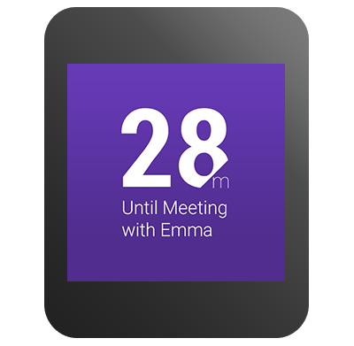
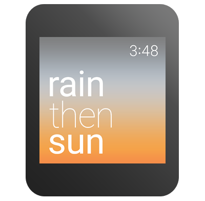
Your watch face can show users contextually relevant data and react to it by changing styles and colors in your design.
The first step in designing a data-integrated watch face is to define a conceptual user outcome based on available data. First, generate a strong concept or outcome you believe is supported by real user needs. What do you want your users to know after they have glanced at your design? Once you have identified your outcome, you need to determine how to obtain the required data.
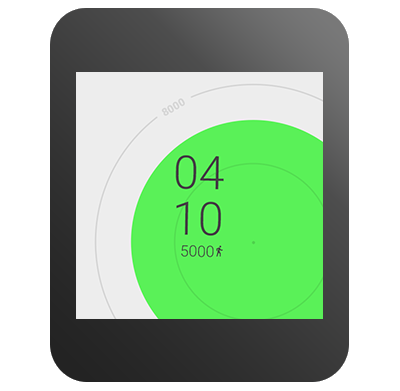
Your watch face concept may include use of data beyond time, such as weather, calendar and fitness data. Consider the inclusion of data integration creatively. Avoid simply overlaying a time-based watch face with extra data. Rather, think about how the data can be expressed through the lens of time. For example, instead of designing a weather-related watch face as a clock with an indication of the current temperature in degrees overlayed, you might design a watch face that describes how the temperature will change over the course of the day.
Once you have solidified your conceptual direction or desired outcome, you will need to begin visualizing your watch face. The strongest watch face designs are highly glanceable and deliver a singular expression of data. In order to identify your singular message, you must identify the most important supporting data point. For instance, instead of displaying an entire month of calendar events, you might decide to display only the next upcoming event. By a process of reduction, you should arrive at a powerful singular expression of data to include in your design.
Make sure your approach begins with insight into the needs and expectations of your users. Test your designs with users to check any assumptions you might have made about your design along the way. Try making a rough sketch on paper and asking a friend to tell you what it means. Try your concept out with lots of different types of data and scenarios. Test your designs with an actual watch screen before you start coding.
The Android Wear companion app gives the user access to all installed watch faces and their settings.
All available watch faces are accessible from the Android Wear companion app or from your bundled third party app. There is no need for a stand-alone launcher icon for Android Wear watch faces.
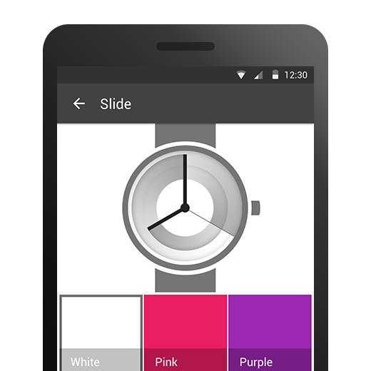
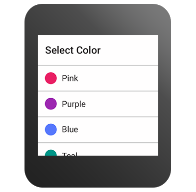
Each watch face that has useful settings can have a Settings panel, accessible from the watch itself and from the companion app on the phone. Standard UI components work in most cases, but you can explore other creative executions once you have built a foundation designing watch faces.
Settings on the watch should be limited to binary selections or scrollable lists. Settings on the phone may include any complex configuration items in addition to the settings available on the watch.
To obtain watch face design examples and detailed measurements for the system UI elements, see the Design Downloads for Android Wear.
Except as noted, this content is licensed under Creative Commons Attribution 2.5. For details and restrictions, see the Content License.
About Android | Legal | Support
 摹客协作
摹客协作 摹客RP
摹客RP 摹客DT
摹客DT 摹客超级版
摹客超级版